When I was a young information designer...
4 min read

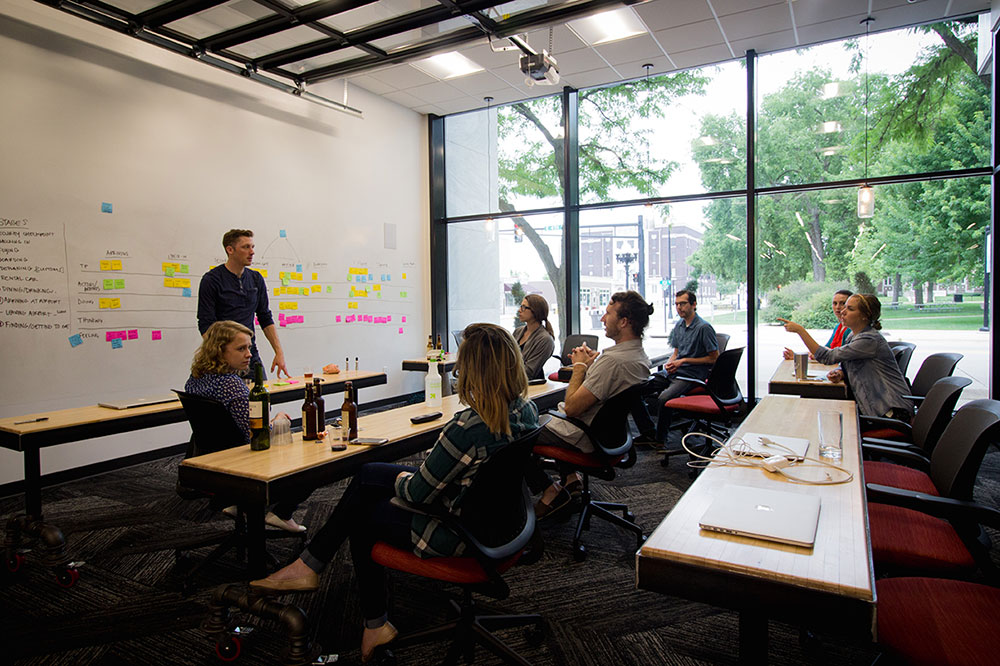
When I was a young information designer card sorting was all the rage. I first heard about it from the work being done at Sun Microsystems by Jakob Nielsen and Darrell Sano. Even then it struck me as too mechanical, too mathematical, to really be applied to helping humans navigate information spaces. The idea (in case you’ve lived under a UX rock or have just been fortunate enough to avoid it) is that you take your information inventory, write the end-nodes on cards, and let real users sort them. Next, you make mathematical conclusions about the most commonly grouped items and let that dictate your site’s taxonomy (in this case, sometimes known as a folksonomy – cute, huh?). During the same time period when Nielsen was sorting cards at Sun, I was interviewing executives at a big company about how they thought about, and made requests for, financial or operational data to help them run the company. I would ask something like, “What reports do you look at on a regular basis?” or “How would you request the information you need to evaluate your part of the operation?” Then I would listen very carefully to the sentence structure of their answers: “I like to look at the monthly tonnage report for the factory in Wichita”; “I need to see the European expense report for the quarter”; “I compare units shipped for each product line to last year.” Do you hear it? Sentence structure reveals a hidden taxonomy. For one person it was time, report, location; for another person it was location, report, time; and for the third person it was report, division, time. This was so interesting to me for two reasons: One, it seemed to be a way to learn about taxonomy without engaging the analytical part of the mind; when you ask someone to tell you the right way to solve a problem he will inevitably tell a different story then when you ask him to solve the problem. Secondly, it revealed a significant issue. These executives used the same basic categories —time, division, report type, location—but had no agreement on the order. For me this confirmed the bias I had against Jakob’s work (at least I acknowledge my self-confirming bias): You can find an acceptable group-think taxonomy, but you will always have people who approach the information space differently. In some cases, a person’s role drove them to think in certain hierarchies and those patterns were well entrenched. A card sorting exercise would have resulted in a very slim victory for one structure at the expense of two or three other strong candidates.
That’s when I began thinking about “flux”, which stood for “Fluid User Experience”. I even have logos and an unfinished web page to show for it. I believed there had to be something other than a tree that could describe how we think about information spaces. In the case of the project I was working on it seemed there were four parallel trees (report, time, location, division) and that each user (sidebar: how many projects do you have were you can interview ALL users? It was amazing.) arranged them in a different order to navigate to the same spot. Plus, each category had it’s own hierarchy: time was linear and broken into nested chunks; reports had a tree hierarchy; and location was mostly a continent-country-city tree structure (but was re-arranged when looked at through the product line structure). My goal became to abandon a single tree and let the user start at any of the four trunks and then work the others in any order. My solution at the time was pretty rudimentary – four pull down menus. If you selected a report first (let’s say “Tonnage”), the other three menus would remove options that didn’t go with that. For example, there was no Tonnage report from the Engineering Center location so it would drop out of the Location menu. Want to pick Time next? Let’s say last quarter. Great, now choose a product line, Agriculture. By now most locations have disappeared and the final choice is easy: Wichita.
That experience has defined how I approach large data problems. Look for parallel trees and let the user climb them in any order. I think most shopping sites today have implemented similar rules. Eddie Bauer lets me start with Men, Women, Outerwear, Shoes, Gear, Home, Swim, and Sale. I’m looking (always) for men’s jackets on sale (even though I have a closet full). Because I can choose where I want to start, it only takes me three clicks to get something in my shopping cart. I think this is great; my wife, however, does not.
I still wish I had gotten the domain name flux.com…