
The Industry
Military & Defence
Our services
Digital products & Experiences
Project Timeline
Eleven Months
Our Deliverables
UI Design, User Research, Persona, Usability Tests, Readability Tests
Project Team

Andy
Strategist

Nick
UX Designer
Every year, 5,000 people are killed or maimed by IEDs.
Soldiers are tasked with the dangerous job of uncovering these IEDs.
The Problem
The software is critical to the soldier’s mission and it wasn’t working with them.
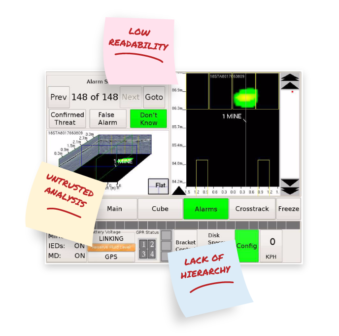
Through our human-centered approach, we uncovered three key problems in the rudimentary touch screen.
Low Readability.
The bright sun washed out the old color scheme, which made screen readability difficult.
Lack of Hierarchy.
The UI was cluttered with information and buttons that weren’t always needed.
Untrusted Analysis.
The system lacked historcial data, which assists real-time threat detection decisions.
Our Solution
Soldiers believed we increased their likelihood of survival.
- Prioritizing making mission critical items easy to identify
- Making historical data more usable for analysis
- Increasing the contrast to make the screen easier to read
- Testing prototypes early to close the gap on usability issues
When the government hired a third-party to test soldiers in the field, our redesigned UX received a System Usability Scale (SUS) score of 80 — 12 points above average!
+12
points above
the global average
Survey Results
93% of soldiers
would like to deploy with the new system.100% of soldiers
felt the new system enhanced their ability to perform the intended mission.93% of soldiers
felt the new system had greater detection capability.87% of soldiers
felt the new system provided greater precision marking capability.87% of soldiers
felt the new system reduced workload.
Alerts
+33%
detection analysis screen real estate

Actions & Menu
We prioritized making mission critical items easy to identify:
We made historical data more usable for analysis.


50
Readability tests to ensure a rapid response

We increased the contrast to make the screen easier to read.
We tested early to close the gap on usability issues.
"Hanging off the back of the armoured vehicle and user testing the UX with soldiers was extremely important. Watching them and walking in their shoes gave us critical insights that helped us make sure the experience we created would have a direct impact on saving lives."
Since the initial release, the user experience has been ported to multiple projects due to its overwhelming success. Operators have praised the user interface for ease of use...future planning has it being fully integrated on the company’s flagship product."

Relationships don't start with a contract.
From general UX questions to project inquires,
let's start a conversation.